4.1. Time Series Viewer
4.1.1. Setup Database Connection
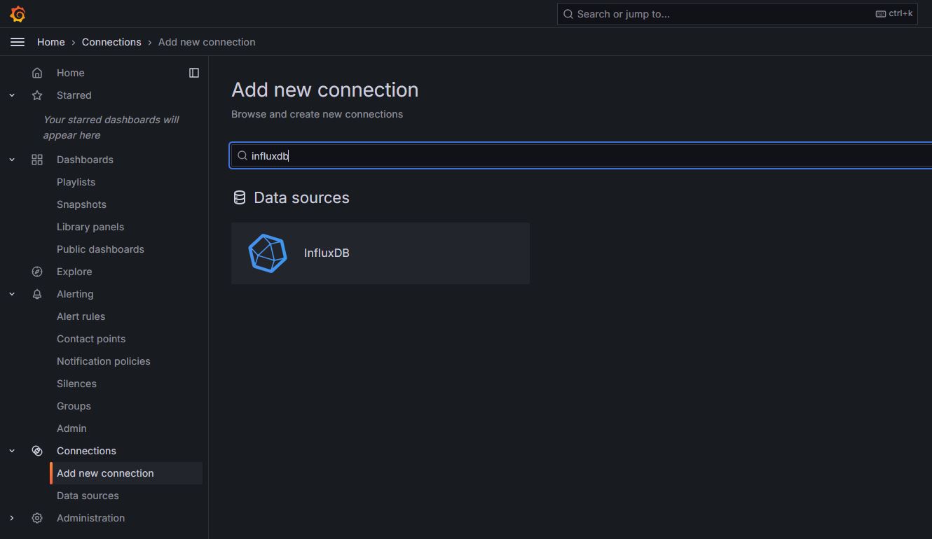
Click Connection
Click Add new connection
Search “influxdb”
Click Data Source InfluxDB
Click Add New Data Source
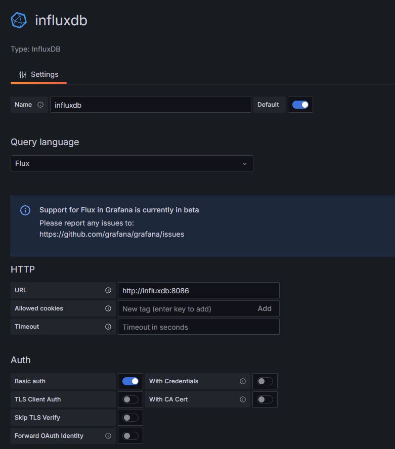
Fill the database name
Choose Query language “Flux”
add URL http://influxdb:8086
toggle Basic auth
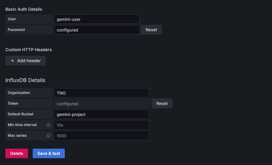
Fill Basic Auth Details
Username: gemini-user
Password: gemini-password
Fill InfluxDB Details
Organization: TNO
Token: <create token InfluxDB> (Follow the steps below to create a token)
Default Bucket: gemini-project
Click Save & test
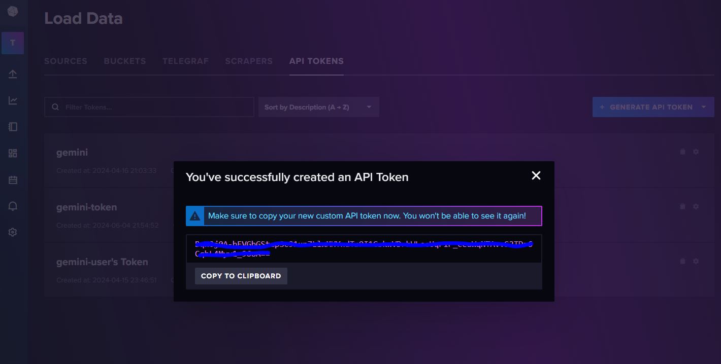
- Create Token Influx DB
Using your browser, log in to <yourdomain>:8086, where <yourdomain> is the cloud address you use to access Gemini
Fill username and password (same as the Basic Auth Details)
Generate API token
Click All Access API Token
Fill Description, e.g. gemini-token
Copy the API token and put in InfluxDB Details
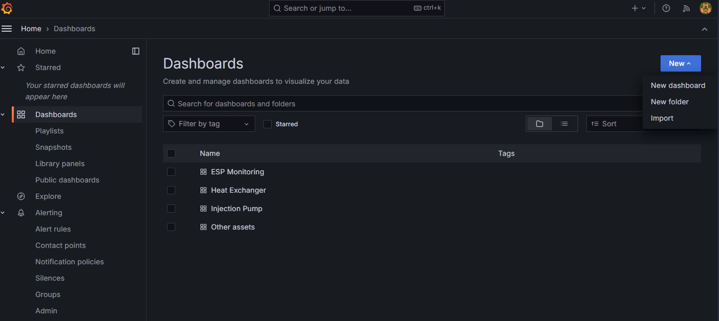
4.1.2. Create Dashboard
Click “New” button
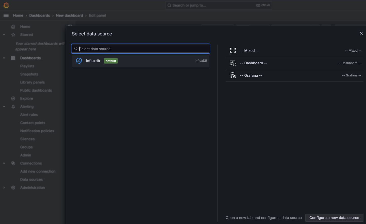
Click “Add visualization” button

Select data source influxdb
if you dont see any data source, please follow section Setup Database Connection
Select Time Series. There are several chart style e.g. bar chart, gauge, pie chart, etc.
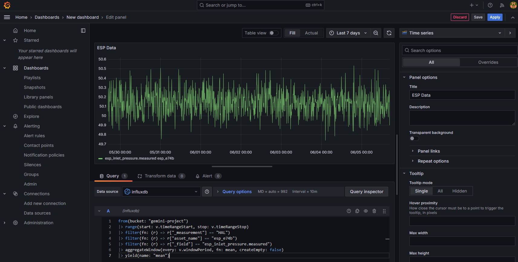
Fill Title
In box A, fill the query code. It is based on FluxQL syntax. See the example below.
from(bucket: "gemini-project")
|> range(start: v.timeRangeStart, stop: v.timeRangeStop)
|> filter(fn: (r) => r["_measurement"] == "HAL")
|> filter(fn: (r) => r["asset_name"] == "esp_e74b")
|> filter(fn: (r) => r["_field"] == "esp_inlet_pressure.measured")
|> aggregateWindow(every: v.windowPeriod, fn: mean, createEmpty: false)
|> yield(name: "mean")
- Parameter explanation:
_measurement : it is the project name
asset_name : it is the component name
_field : it is the tagname that we want to plot.
4.1.3. Save Dashboard
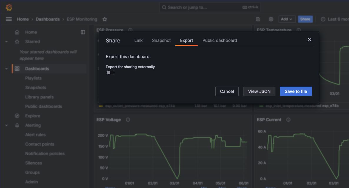
Click “share” button
Click Export tab
Click “Save to file” button
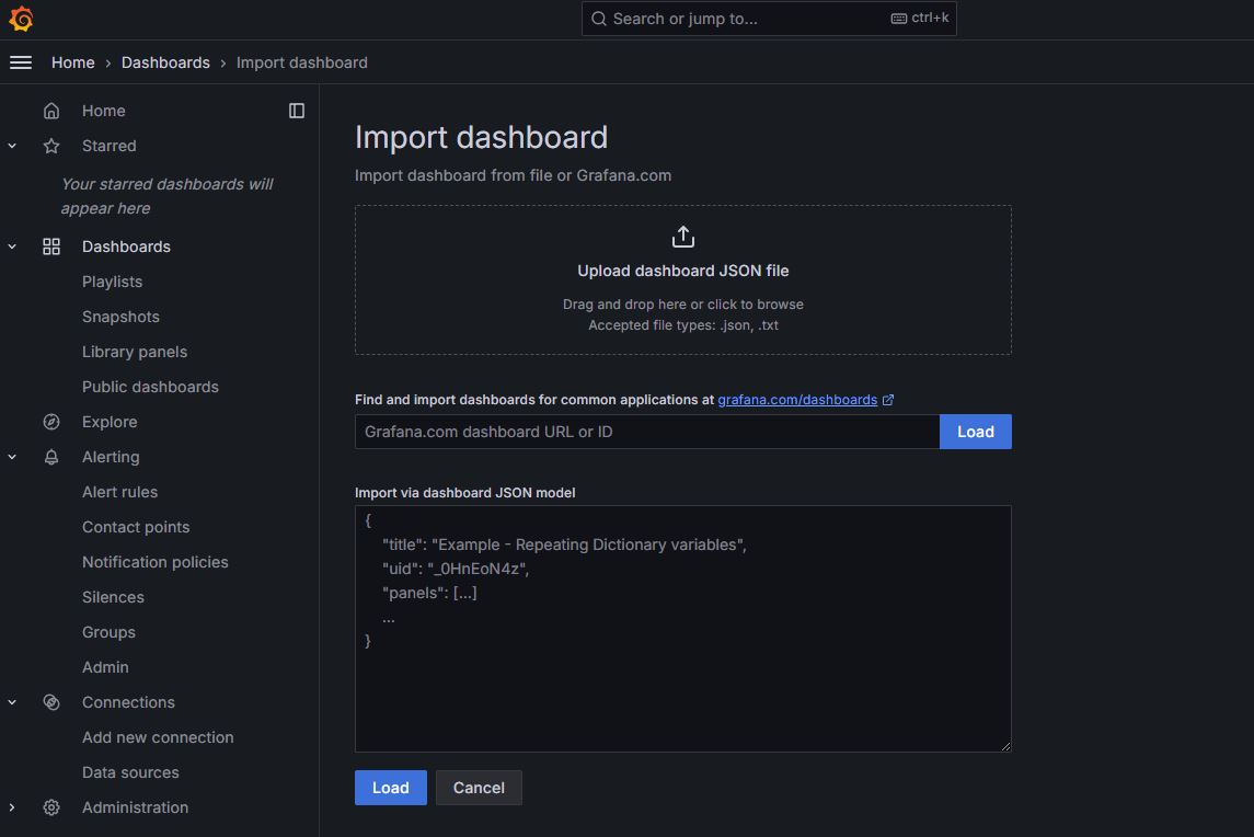
4.1.4. Import Dashboard
Click “New” dropdown button
Click Import
Click “Save to file” button
Upload JSON file from template folder: gemini-user-interface/src/static/grafana_template
or copy paste JSON text in the box